Economic outlook: Canada: Skating on thin ice (Long Version)
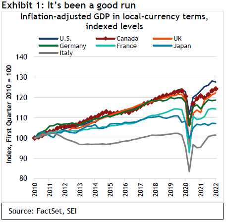
The Canadian economy has performed quite well for over a decade. Since the beginning of 2010, inflation-adjusted gross domestic product (GDP) has climbed a cumulative 24.2% through the end of March 2022. As we show in Exhibit 1, that gain in overall business activity was bested only by the U.S. among the top-seven industrial economies. The country re-attained its pre-COVID-19 peak at the end of last year, led by solid gains in household spending and business investments in physical assets (such as land and machinery).
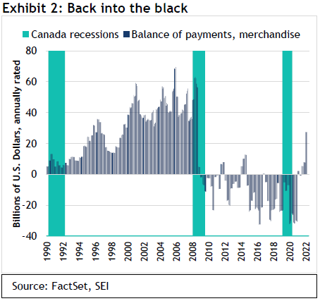
Trade also has been a positive factor in the past year as Canada benefited from higher commodity prices and strong demand from the U.S., its largest trading partner. The merchandise trade balance has been consistently in the black since mid-2021. Prior to the global financial crisis of 2007 to 2008, the country also ran merchandise-trade surpluses. Yet from 2008 through the first half of 2021, Canada was usually in a deficit position. That has since reversed, as we highlight in Exhibit 2.
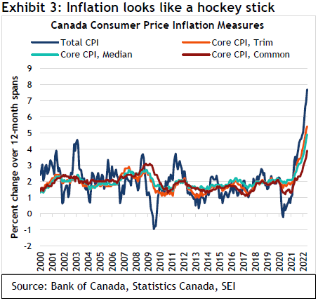
Canada now faces a serious inflation problem, however. Exhibit 3 underscores the fact that consumer prices, no matter how they are measured, are rising faster than anything experienced in a generation. The conventional measure, the total consumer-price index (CPI), advanced 7.7% over 12 months ended May. The core CPI—which excludes the more-volatile food and energy prices to better reflect underlying inflation trends—was up 6.1%. Even the Bank of Canada’s (BoC) preferred measure, the core CPI-common—which tracks common price changes across categories in the CPI basket—increased by 3.9% over the past year. We expect the core CPI-common to continue its climb in the months ahead given the spreading of inflation across categories.
As in the U.S. and the U.K., Canada’s economy looks to be overheating. Exhibit 4 shows that growth in hourly wages is accelerating but still lags the gains posted prior to the COVID-19 pandemic.
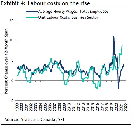
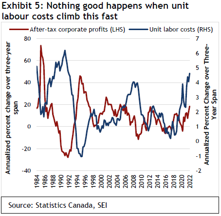
Unit labour costs (the difference between total compensation and productivity growth) are far more concerning. They have jumped by 8.4% over the year ended March, a gain that is even higher than the inflation rate.
In Exhibit 5, we contrast the three-year annualized change in unit labour costs with economy-wide corporate profits. A sharp acceleration in unit-labour-cost inflation has often been associated with a sharp deceleration in corporate profits growth. The correlation broke down in the aftermath of the global financial crisis, and profits have risen quite sharply in recent years despite the upward pressure in costs. This reflects an ability to ultimately pass higher costs onto the consumer. We wonder how long this will last. There were big labour cost upswings during the late 1980s and the mid-2000s. Both ended in recessions, with major reversals in profit trends toward the downside.
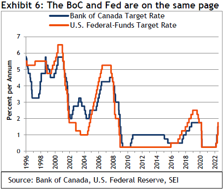
Monetary policy has certainly turned from a tailwind to a headwind, as we show in Exhibit 6. The BoC is following the U.S. Federal Reserve (Fed) in lockstep. We expect a 75 basis-point increase in the BoC’s policy rate at its next meeting in July, followed by a 50-to-75 basis-point hike in September. While Canada’s economy benefits from its heavy exposure to commodities, the prospect of the sharpest interest-rate up-cycle in decades provides a challenging economic backdrop.
The “value restoration” project is underway.
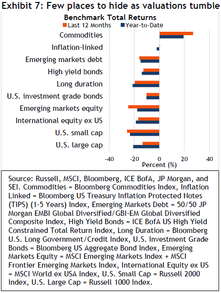
It has been a tough slog for investors this year, with stocks and bonds simultaneously facing steep price declines amid extreme volatility in financial markets. Several different categories of stocks have already experienced peak-to-trough declines of more than 30%, including the Russell 2000 Index, the NASDAQ Composite Index, and the S&P 500 Index’s information technology sector. Over the first half of the year, seven of the 11 S&P sectors declined by 10% or more. Energy, which was up nearly 30%, was the sole sector to post a gain for the six-month period.
In sharp contrast to the dynamic that has typically played out during previous episodes of significant equity-market declines, bonds have not provided much of a diversification benefit this year. Long-duration bonds, as measured by the Bloomberg U.S. Long Government/Credit Index, have suffered a year-to-date decline of 21.4%.
There have been few places to hide, as we show in Exhibit 7. Only commodities, as measured by the Bloomberg Commodities Index, recorded a broad and robust gain (rising19.5% thought the end of June in the first half of 2022. Inflation-linked bonds, represented by the Bloomberg 1-5 Year U.S. TIPS Index, have held their own so far this year, while other fixed-income categories suffered declines rarely seen over a six-month period.
Reasons for this carnage are well-known: the worst inflation in four decades; the turn in global central-bank monetary policies from extraordinary ease to more restrictive settings; Russia’s invasion of Ukraine; and fears that China’s zero-COVID-19 policy will continue to disrupt not only its own economy but that of the world.
While the words “recession” and “stagflation” seem to be on everyone’s lips, we have a less dire perspective. In light of the aforementioned events, we view price declines in the equity markets as value restoration—that is, returning stock valuations (particularly for high-flying growth and technology names) to something more reflective of economic fundamentals.
Bond pricing, meanwhile, has incorporated the expected removal of extraordinary levels of government-sponsored stimulus from the fixed-income market as well as higher interest rates on short-term government securities. We think most of the damage has been done, that inflation will slow, and any recession will take place later versus sooner and be on the milder side.
Inflation higher for longer.
It has been our mantra for the past year that inflation will be higher for longer than most economists and investors appear to expect. We believe this remains the case, although the gap between our expectations and those now priced in markets has narrowed considerably. Investors, however, still seem to be betting that inflation pressures will ebb significantly in the second half of this year and through 2023. By 2025, markets are implicitly pricing in an inflation rate that matches the Fed’s 2% target.
As shown in Exhibit 8, near-term (two-year) inflation expectations, measured by the difference between the yield on U.S. Treasury bonds and the yield on U.S. Treasury inflation-protected securities (TIPS), have risen sharply.
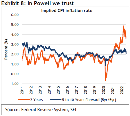
The 2-year breakeven rate is currently 3.6%. Recall that breakeven rates represent the difference between the original coupon rate of a bond and the real yield of an inflation-protected bond with the same maturity date. A rising breakeven rate suggests that expectations for inflation have risen. Yet the current rate is still less than half the 8.6% consumer-price rise over the 12 months ended May. The 5-year breakeven rate, meanwhile, is only 2.6%, while the expected inflation rate five to 10 years in the future (the so-called five-year/five-year rate) remains rather sedate at 2.1%. That is pretty much in line with the Fed’s implicit target for the U.S. CPI. (The central bank’s formal target of 2% is based on the personal-consumption expenditures price index, which usually runs a few tenths of a percentage point below the CPI.) The Fed is hanging its hat on the apparent stability of investors’ inflation expectations in the longer run. If the 5-year, 5-year forward rate were to rise toward 3%, it would force the central bank to get even more aggressive in tightening monetary policy than is currently built into its own projections of where the federal-funds rate needs to go.
We have a somewhat more pessimistic view, with CPI inflation perhaps settling roughly a full percentage point higher than is projected by the Fed and currently priced into the TIPS market. We also think that price increases might continue to surprise on the upside in the near term, although the rate of change in the CPI and other measures of inflation are almost certainly close to a peak.
Exhibit 9 breaks down the CPI into two categories: (1) “sticky” products and services that tend to have persistent price trends and (2) “flexible” items that are much more volatile and gyrate in relatively short cycles.
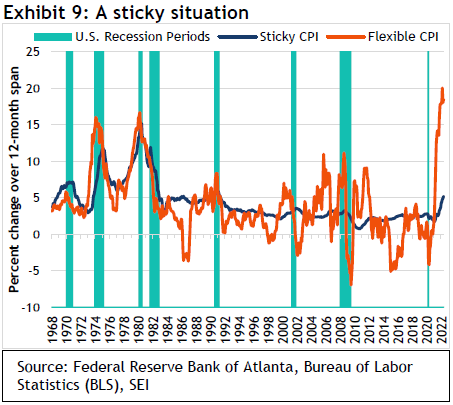
The most heavily weighted items in the sticky CPI are housing-related (owners’ equivalent rent and rental housing). Food away from home and recreation also have relatively high weights. The most important products in the flexible CPI basket are new vehicles, natural gas and electricity, motor fuel, and lodging away from home. Note that the sticky CPI accounts for about 70% of total CPI, while flexible items carry only a 30% weight.
The flexible CPI has been on a tear for more than a year. Base effects were certainly an issue in the spring of 2021 as prices rebounded from deeply depressed readings during the early months of the pandemic in 2020. More recently, the index has been driven by sharply rising prices in energy, food, and vehicles beyond those so-called base effects. In March, the CPI peaked with a year-over-year gain of 20%. It is now coming slightly off the boil, although the ongoing shortages of food and energy globally may prevent a full reversal back to zero or negative year-on-year readings until the economy slows substantially further.
Of even greater concern is the behaviour of the sticky CPI. Its ups and downs have been quite muted since the mid-1980s, but price increases have accelerated in a relentless fashion since January 2021—reaching more than 5% in May, the highest level in more than 30 years. The annualized rate of gain in the CPI over the past three months has been even sharper, amounting to 6.8%.
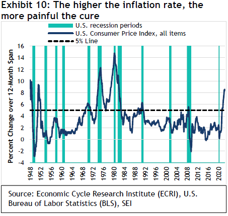
While Fed Chair Jerome Powell is still hoping that the central bank can achieve a “softish” landing—where inflation gradually decelerates back to the central bank’s 2% target without a recession—the only time since the end of World War II that was achieved with an inflation rate of more than 5% was in the 1951-to-1952 period. We show the history of CPI inflation and recessions in Exhibit 10.
Even after the latest hike in the fed-funds rate to a 1.50%-to-1.75% range, the central bank still appears woefully behind the inflation curve. Fed-funds-rate futures indicate expectations for a series of increases between now and year-end that would bring the funds rate to 3.25%. The peak rate is indicated to be around 3.5% a year from now. A projected decline in the second half of 2023 suggests that markets are pricing in a recession by that point.
We believe this is a reasonable forecast, but the actual outcome will depend on how quickly the economy weakens and inflation ebbs. The evidence as of today suggests to us that the U.S. economy may continue to show a resiliency that surprises both the Fed and investors. For instance, as we highlight in Exhibit 11, the labour market remains exceptionally tight.
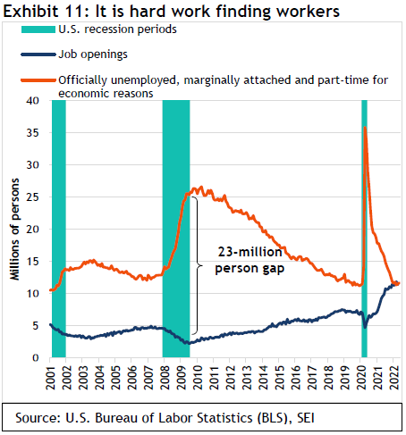
This chart compares the number of job openings to the total number of persons who are officially unemployed plus so-called discouraged workers (those claiming to want a job but not actively seeking employment) and those who work part-time but would prefer a full-time position. Using this broad definition of unemployment and underemployment, there is roughly a one-to-one correspondence of available individuals to fill those job openings. Just before the pandemic struck, there were 4.3 million more unemployed and underemployed individuals than the number of jobs available, but the labour market was nonetheless considered quite strong. Back in 2009 and 2010, the slack in the labour market was extraordinary, with more than 25 million unemployed and underemployed people competing for just 2.5 million jobs being advertised.
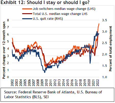
Until a better balance between the demand and supply of labour is achieved, one should expect further large wage gains at the lower end of the wage-income spectrum (where the job market is tightest). But even at the upper end of the income scale, companies competing for talent are being forced to provide additional perks such as remote work, bonuses, and improved health and welfare benefits. Exhibit 12 shows that people who switched jobs over the past 12 months have enjoyed a sharper-than-average wage gain of 7.5%. That still lags the increase in the overall CPI rate, but it is better than the median wage gain for all workers. It therefore should not be surprising that the U.S. quit rate is significantly higher than in 2019 or at the previous economic peak in 2007.
Still, there are signs of economic trouble ahead. The surge in mortgage rates is delivering a big blow to the housing market. Exhibit 13 shows how the yield on 30-year fixed-rate mortgages has soared this year to its highest level since 2008. Since home prices have continued to rise, housing affordability is deteriorating even more than suggested by the jump in interest rates. In April this year, the housing affordability index, published by the National Association of Realtors, was already at its lowest point since April 2007. Affordability has since only worsened.
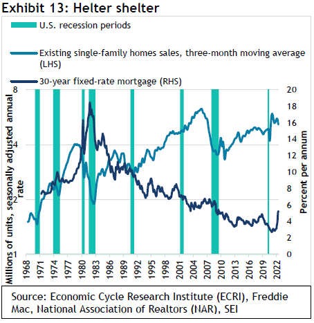
Existing home sales actually peaked early in 2021, owing to a lack of supply rather than a lack of demand. It seems inevitable that sales will decline even further in the months ahead in response to the mortgage-rate shock. While we cannot rule out a downturn in sales activity that looks similar to that of the 2005-to-2008 meltdown, it should not have the same catastrophic impact on the economy or the financial markets. Homebuyers in the current cycle have been far more credit-worthy and have made considerably higher-than-average down payments, and the proportion of fixed-rate to adjustable-rate mortgages is much higher. Banks are also far better capitalized, and the leverage of the financial sector to the riskier tranches of the mortgage market remains low. In addition, the level of mortgage rates is no higher now than it was in the early 2000s and is still well below the levels recorded prior to 2002. Between 2001 and 2003, the U.S. unemployment rate rose from 3.9% to 6.3%. Home sales barely skipped a beat.
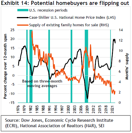
The trajectory of home prices should also undergo an abrupt shift. Exhibit 14 highlights the sharp gain in home prices since the onset of the pandemic. The rate of gain in the S&P CoreLogic Case-Shiller U.S. National Home Price Index now appears to be peaking following a record climb of almost 20% on a year-over-year basis over the 12 months ended March and a cumulative 40% over the past two years. At the very least, prices are likely to plateau, if not give back some of the excessive price gains recorded over the past two years. But, once again, the global financial crisis is probably not the best template. There should be far fewer mortgage foreclosures and forced sales. With the supply of homes on the market falling below two months at the current sales pace, the market nationally has never been as tight as it has been this year.
A sharp decline in home-price inflation will eventually feed into the CPI, but the lags tend to be long as home prices have been fluctuating much more sharply than the owners’ equivalent component of the CPI. One should not expect any immediate relief in CPI inflation coming from the housing sector.
Beyond housing, economists cite the big increase in retail inventories as a harbinger of recession. Companies such as Target and Walmart have reported being saddled with too much of the wrong stuff as consumers switch their buying from pandemic-related items to services and goods associated with a more mobile lifestyle. Supply-chain issues that delayed the timely delivery of seasonal goods have also added to retailers’ inventory woes. Companies will need to discount this merchandise in order to clear their shelves. This is one reason goods-price inflation should decelerate rather sharply in the near term.
We are doubtful that the inventory problems are serious enough to throw the economy into recession any time soon. Exhibit 15 tracks the inventory-to-sales ratios of two industries—department stores and car dealers—adjusted for inflation. Department stores have certainly experienced a notable rise in the stock of goods available, but the level is still in line with the historical average over the past 20 years. Auto dealers continue to experience a severe shortage. Assuming logistical issues improve and vital parts reach manufacturers in greater numbers, car sales should rise as pent-up demand is satisfied. Price for cars and light trucks should also begin to ease.
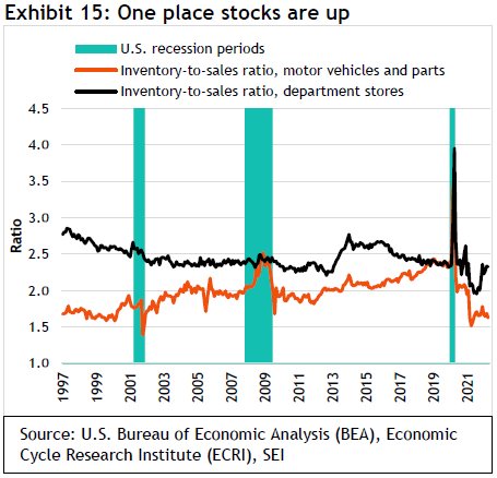
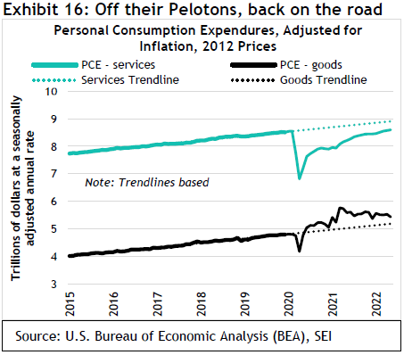
Exhibit 16 underscores the change in overall consumer buying patterns. Spending on services remains below the pre-pandemic trend, but it is catching up quickly as shoppers return to their normal patterns. Meanwhile, the consumption of goods is still running above the 2015-to-2019 trend line (purchases peaked 15 months ago).
There is no denying that the surging cost of capital will slow economic growth. But changes in monetary policy affect the economy with a long and variable lag. As we previously pointed out, the financial strength of U.S. businesses and households is likely to ebb. Yet the starting point is a high one. Monetary policy has been extraordinarily easy in recent years, leading to explosive growth in the money supply. This is highlighted in Exhibit 17, which charts the three-year change in the M2 money supply (a measure of total currency held by the public that includes cash, checking deposits, and other cash-like vehicles). We also advanced this series by two years into the future to show how money-supply growth is still a leading indicator of CPI inflation, although perhaps not a very reliable one.
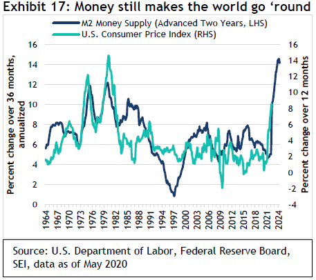
Growth in money has peaked, but the high-water mark of a 14.5% annualized gain is even greater than any rate recorded during the persistently inflationary 1970s. This chart probably exaggerates the implied amount of upward pressure in future inflation. Nonetheless, even if the inflation rate declines from here, the liquidity injected into the economy will take time to flow out.
The U.S. has caught a cold. Will the world catch pneumonia?
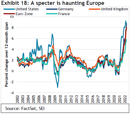
The rest of the world faces similar challenges to the U.S., and then some. Inflation in the U.K. and major euro-area countries has accelerated almost in tandem with the U.S., as we show in Exhibit 18. We could see inflation in Europe surpass that of the U.S. in the months ahead given the region’s greater vulnerability to energy blackmail by Russia. The Bank of England, for example, projects that U.K. inflation will peak above 11%.
Although the U.S. has the tightest labour market, other major developed economies aren’t too far behind, as shown in Exhibit 19.
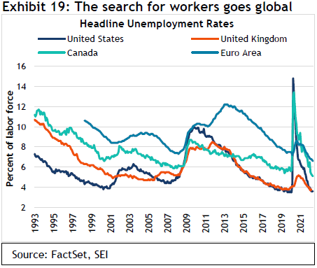
The U.K. also has an unemployment rate of below 4%. Labour shortages in that country have been exacerbated by Brexit, which cut off the easy flow of workers from the EU. Canada and Europe usually have unemployment rates that are considerably higher than the U.S. and U.K. That remains the case, but both report jobless totals that are below previous cyclical lows. All this suggests that workers are in a strong position to seek bigger wage gains in an effort to keep up with inflation. The possibility of a global wage-price spiral still cannot be dismissed out of hand. This is another reason why central banks may be forced to raise interest rates more than they would prefer.
By contrast, leading indicators of economic activity are already pointing to below-average economic growth for many countries. Declining financial-asset prices, worsening consumer and business sentiment, and weaker demand are among the reasons for the economic slowing. The extent of the deterioration is still not on par with an outright recession, but the trend is concerning. Exhibit 20 suggests that the U.K. is seeing the sharpest deterioration among major industrial countries. Only Japan is bucking the trend.
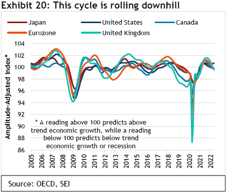
Japan’s decision to stick with an ultra-loose monetary policy in conjunction with its strategy of yield-curve control has caused the yen to move sharply lower against the U.S. dollar and other currencies, which has served to raise the country’s export competitiveness.
More broadly, only about one-third of the 39 countries tracked by the Organization for Economic Cooperation and Development (OECD) are still reporting leading indicators that point to above-average economic growth. That is down from 90% of countries this time last year.
On top of all the other problems facing Europe, the need to hike interest has once again raised the specter of another periphery debt crisis. Italian 10-year bonds are trading some 60 basis points higher against German bonds than they were at the start of the year. This is on top of the 150 basis points jump in German rates that has been logged over the same six-month stretch. Exhibit 21 tracks the trajectory of the periphery bonds versus the German 10-year since 2010. Obviously, the stress has not reached the crisis levels of the 2010-to-2012 period. But the European Central Bank is worried, and has vowed to support the weaker members of the eurozone with continued bond purchases.
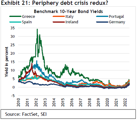
As was the case in that earlier period, the economic interests and priorities of the strongest countries are diverging from their weaker neighbours. The German-led bloc needs a more aggressive tightening of policy along the lines of what the Fed is expected to do. Meanwhile, the weaker countries, especially Italy and Greece, now bear an even heavier debt burden relative to the size of their economies than was the case a decade ago. The interest expense on that debt could get out of hand fairly quickly if the cost of capital continues its sharp upward trajectory. The European Central Bank (ECB) is so concerned about the situation that it actually held an emergency meeting the same day as the Fed’s interest-rate announcement in order to assure markets that it is working on “an anti-fragmentation tool” that will keep yield spreads narrow while still allowing the central bank to fight inflation. Details will be announced in July at the next regular meeting of the ECB Governing Council. Ten years ago, then-ECB President Mario Draghi was able to save the euro and effectively put an end to the periphery debt crisis by uttering the words “whatever it takes.” It might take more than an impromptu comment to nip this potential crisis in the bud.
High inflation and rising interest rates make no one happy. In the U.S., President Joe Biden is burdened with extremely low approval numbers. His Democratic majority in the House and Senate is in jeopardy this November. In the U.K., Prime Minister Boris Johnson recently survived a no-confidence vote, but he is clearly weakened politically and resigned from office on July 7. In France, President Emmanuel Macron won re-election but lost his majority in the National Assembly and must now cobble together a coalition on an issue-by-issue basis in order to pass any legislation. In Latin America, Peru, and Colombia’s recent shifts to the extreme left and Brazil’s possible move in the same direction later this year could make life uncomfortable for businesses and the elite in those countries. In short, it is getting harder to govern at a time when leadership is most needed.
On a more positive note, China’s economy appears to be in recovery mode. COVID-19 lockdowns in Beijing, Shanghai, and other parts of the country have eased. The picture could change quickly if there is another eruption of infections, but the Chinese government seems eager to reduce frustration among the populace in the lead-up to the Communist Party’s gathering in October. Regulatory restrictions that have hamstrung various industries also are easing now that the largest companies have been brought in line with the government’s mandates.
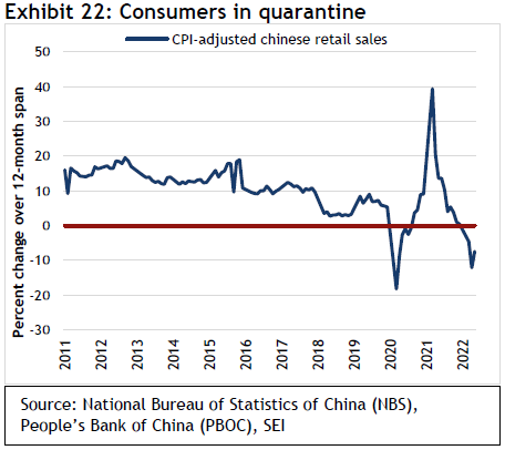
If China were a democracy, President Xi Jinping would be in political hot water, much like other political leaders who are facing the wrath of a COVID-19-weary and frustrated electorate. The zero-COVID-19 policy pursued by the Chinese government has hurt the economy to an extent seldom seen in the past three decades. Inflation-adjusted retail sales, which we show in Exhibit 22, fell deeply into negative territory on a year-over-year basis as households in dozens of major cities were forced to stay home or in quarantine centers.
Home sales in China have also plummeted, falling 34% over the 12 months ended May—a greater decline than in the spring of 2020. Of course, home sales have been subject to frequent boom-and-bust cycles over the years. Chinese authorities are now trying to revive the property market by lowering mortgage rates, cutting mortgage down-payment requirements, and encouraging banks to start lending again.
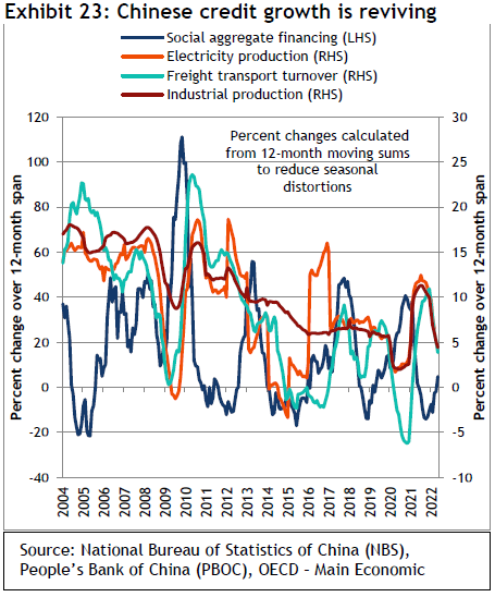
Economy-wide lending has picked up, finally turning positive for the first time in a year, as we show in Exhibit 23.
If that trend continues, other measures of current economic health should begin to recover too. Whether that will be enough to stave off a global recession is doubtful, however, in view of the rising interest-rate trend in advanced economies. It may even prove counterproductive if a revival in Chinese demand for energy and other raw materials exacerbates the commodity-price boom at a time when global supplies are still constrained.
The markets have adjusted, but have they adjusted enough?
The poor performance of the equity and bond markets this year suggests that a lot of bad news has already been discounted. Exhibit 24 highlights the de-rating in equity valuations that has taken place. For U.S. large-cap stocks, the 12-month forward earnings multiple has fallen from 22.5 times at the end of last year to 16.4 times at the end of June. In the same period, the U.S. technology sector has endured an even sharper decline in its price-to-forward earnings multiple, from 29.3 to 20.1. Outside the U.S., the multiple contraction has generally been far less steep. While price-to-earnings ratios (P/E) have dropped substantially, they do not appear extremely depressed when using a 10-year average valuation as the yardstick. The U.S. technology sector is still trading at a 21% premium to its 2009-to-2019 average. By contrast, the multiples for developed stock markets outside the U.S. are valued at a 4.5% discount to their 10-year historical averages.
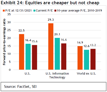
Exhibit 25 examines U.S. valuations in greater depth, using the so-called Blue Angels concept created by economist Ed Yardeni.
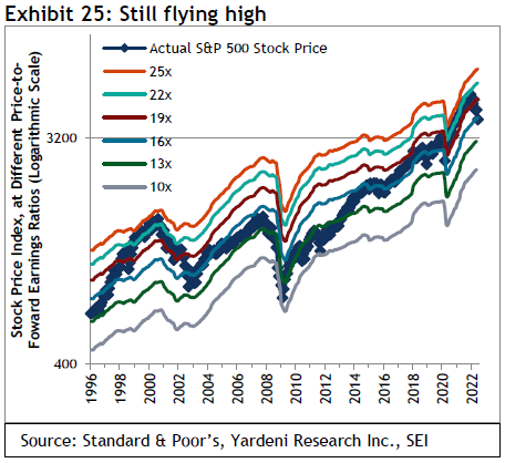
It compares the actual level of the S&P 500 (price only) against would-be levels of the Index at different price-to-forward earnings ratios. Yardeni calls the chart the “Blue Angels” because the ratio lines “fly” in parallel formation like the famed U.S. Navy squadron of the same name, while the actual S&P 500 (depicted here as the blue line with the diamond markers) cuts through the “contrails” of the various forward P/E ratio levels. The chart not only shows how expensive equities are at any given moment relative to history, but it also highlights the current trajectory of 12-month forward operating earnings projected by bottom-up security analysts. Climbing contrails point to rising earnings estimates, thereby supporting a higher stock price at a given P/E ratio.
The 17.9% price decline in the S&P 500 recorded in the year to date contrasts sharply with the ongoing increases in forward-earnings estimates. The result is one of the sharpest reductions in stock multiples outside of a recession in the past 25 years. We think this divergence simply reflects the fact that the rate at which investors discount future earnings and cash-flow streams has gone up sharply. It is no coincidence that the big technology companies, as good as they are, have endured such a strong de-rating. More speculative beneficiaries of the low-rate environment—companies with a good story but little in the way of earnings; digital currencies; meme stocks; and special-purpose acquisition companies (SPACs)—have suffered even greater damage. According to data supplied by Ned Davis Research, nearly half of the components in the NASDAQ are 50% or more below their peaks of the past year.
The froth certainly appears to have been taken out of the financial markets by this year’s stock-and-bond pullback. That’s the good news. The bad news is that an economic recession and a corresponding decline in earnings may not yet be fully priced into markets. The earnings multiple for the S&P 500 is still slightly higher than its 10-year average, as we mentioned above. However, multiples tend to contract as projected earnings estimates decline. During the global financial crisis, the forward P/E ratio bottomed out at 10-times earnings on a forward earnings decline of 38%. The bursting of the tech bubble in 2000, followed by a relatively moderate eight-month recession between March and November of 2001, recorded a trough P/E of 14.
At this point, we have little reason to expect the kind of financial and economic crisis that hit full-blast in 2008 around the time of the Lehman Brothers’ bankruptcy. The tech bust of 2000 may be the better template. As in this cycle, the speculative juices were flowing around the turn of the millennium. Valuations on exaggerated long-term earnings estimates were excessively high. Although forward P/Es have again hit similarly high readings, the big difference between then and now is the level of interest rates. In 2000, two-year U.S. Treasury notes and 10-year U.S. Treasury bonds climbed above 6.5%; today, those yields remain closer to 3%, thereby supporting a higher multiple.
In any event, a mild recession along the lines of the 2001 experience appears to be a more likely economic scenario than a rerun of the global financial crisis. The timing of its onset is still unclear, however. So, it is possible that earnings multiples do not need to contract much further—as long as bond yields stabilize near current levels and do not climb significantly higher.
Admittedly, analysts’ earnings are probably too high and will need to be cut if a recession materializes. The 2001 recession recorded a peak-to-trough decline of 16% in projected earnings. In fact, most earnings cycles prove to be relatively mild. According to Ned Davis Research, the average realized S&P 500 profits decline on a generally accepted accounting principles (GAAP)-reporting basis during all recessions since 1948 averaged 16.6%, with a median drop of 8.2%. Analysts’ projected earnings, however, are calculated on an operating basis, not a GAAP basis, and therefore are not skewed to the downside by one-off write-downs. In addition, while analysts’ forward estimates tend to track actual operating earnings, they do not vary quite as much. The bottom line is that the trough in equity prices might be as little as an additional 5%-to-10% decline in the S&P 500, even if a recession does develop.
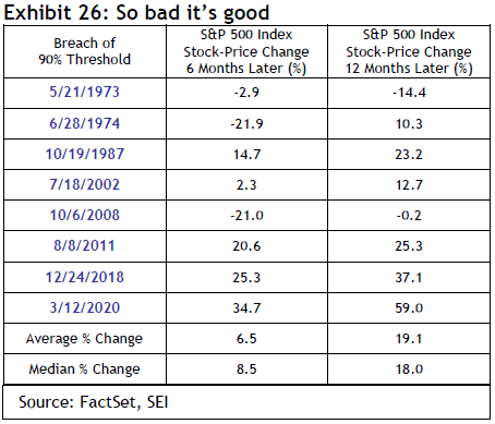
We also note that irrational exuberance among investors is now long gone. Measures of investor sentiment are about as bearish as they ever get. The recent selling has been so intense and broad-based that one of our favourite technical indicators has almost been triggered. The percentage of S&P 500 components trading below their 200-day moving averages hit 89% in mid-June, almost reaching the 90% mark that historically signals a buying opportunity. As we show in Exhibit 26, this 90% threshold has been breached eight times since 1973, most recently on March 12, 2020. The average price gain in the S&P 500 over the six months that followed amounted to 6.5%, while the 12-month average appreciation is 19.1%. On the three most recent occasions when this indicator was triggered, stocks posted spectacular gains over the subsequent six- and 12-month periods. But, as with most indicators, the financial and economic environment must be taken into account. Deep recessions and crises can keep equities under sustained downward pressure. Such was the case in 1973, 1974, and 2008.
Imagine if an investor at the beginning of 2021 were told that in one-and-a-half years, COVID-19 would still be causing havoc in supply chains; Russia would be months into a brutal attack on Ukraine that sent energy prices soaring; and the Fed would have embarked on its most aggressive tightening cycle since 1994. That investor would likely have been sorely tempted to sell out of the stock market at the time. Had they done so, there would have been a substantial opportunity cost as the S&P 500 (total return) continued to appreciate, gaining 29.5% over the next 12 months before peaking on January 3 of this year—leaving that investor with slightly worse performance than one who remained in the market the whole time.
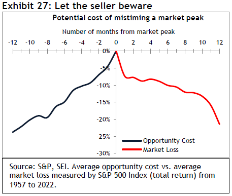
The longer a bull market goes and the more stretched equity valuations become, the more nervous investors tend to get. Yet, as we highlight in Exhibit 27, reducing equity exposure too soon can lead to foregone profits as equity prices continue to advance. Over the 10 market cycles since 1957 that we examined (as measured by the S&P 500), the average opportunity loss for an investor who sold 12 months before a market peak totaled almost 24%. Even if one were prescient enough to sell just three months ahead of the market top, the average opportunity loss would have amounted to almost 10%. Selling just one month after a peak would have resulted in an average realized loss of 7.4%. Exiting the market six months after a peak would leave an investor with a 10% average realized loss.
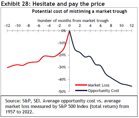
The above exercise doesn’t even consider the opportunity or actual losses sustained in the process of picking the bottom of a bear market when re-establishing equity exposure. The COVID-19-related bear market of 2020 lasted only 40 days, with the S&P 500 (total return) falling 33.8% over that period. Investors who correctly understood the serious impact that the pandemic would have on U.S. and global economic growth may have bailed out of the market. But the ensuing monetary and fiscal response was so stunningly aggressive that risk assets turned on a dime. Any hesitation to reinvest would have been increasingly costly over the following 12 months. One year after the brief bear market in 2020, the S&P 500 (total return) was up 77.8%.
As we show in Exhibit 28, bull markets are at their most explosive in their early stages. Missing the initial gain off the lows typically results in a substantial opportunity loss. Based on the historical average, investors who miss the trough by even one month experience a 15% opportunity loss; the longer one hesitates to reinvest, the more those losses build. One year past the trough, the S&P (total return) is 46% higher, on average.
Even if there is more bad news and additional stock-price weakness in the months ahead, we would argue that it is probably too late to sell. As of June 30 this year, the S&P 500 is already down about 20% from its peak on a total-return basis. That decline nearly matches the average 12-month decline in the S&P 500 since 1957. The “value restoration” project might still be ongoing, but much work has already been done. Of course, we do not know how much longer it will take to reach completion, but the cost to complete the project is likely to be made up quickly once a new bull market begins.
Predicting the future is a hazardous venture most of the time. In view of the uncertainties facing investors at the present time, the prediction game is even more challenging than usual. Accordingly, we are (perhaps more than ever) committed to a diversified approach to investing. We present our portfolio positions as of June 30, 2022, below.
What actions are our portfolio managers taking?
When market volatility increases, anxious investors are often eager to make changes to their portfolios in hopes of mitigating losses. While we recognize the desire to take action as a natural human response to threat, our long-standing sentiments are that markets are unpredictable, fundamentals matter, diversification is an investor’s friend, and market-timing is not a successful long-term strategy. Accordingly, it should come as no surprise that we have not made radical alterations to our portfolios in response to market turmoil. We believe that investors’ portfolios are better served by an unwavering investment strategy regardless of whether a given market segment is flying high or crashing and burning.
With that in mind, our focus has remained on building portfolios based on our alpha-source framework. For equities (where most investors were primarily focused until recently, when bond yields became more attractive), that means seeking exposure to strategies that are focused on either momentum, value, quality, or some combination of those alpha sources, depending on the strategy’s objective. At the highest level of asset allocation, we continue to regard value as the most attractive alpha source due to an environment characterized by a combination of elevated valuation dispersions, positive momentum, shorter duration than growth stocks in a rising yield environment, and a more balanced risk profile.
Taking a closer look at asset allocation, Canadian equities have held up better than most other equity markets due courtesy of significant exposure to energy and limited exposure to high-growth technology stocks. Performance dispersions have been high, which has been a positive for active managers in terms of providing security selection opportunities. The overlap between the performance of value stocks and momentum stocks is higher than average, given that many energy names are screening well within both areas. Given this dynamic, we had a meaningful exposure to value during the quarter. Exposures to momentum and quality are also positive. With the market pull-back, valuations for quality-oriented stocks look reasonable. Commodities tend to perform well in higher inflation environments. Given the backdrop of the current environment, the commodity-heavy Canadian equity market stands to benefit.
In the U.S. large-cap space, our strategic tilt to value continued to deliver alpha. Holdings in consumer staples and health care performed well during the quarter. Our avoidance of mega-cap stocks was beneficial. Despite the massive declines in technology stock prices, valuations in the sector remained high. Energy was the best-performing sector during the quarter. Our exposure to energy was still roughly neutral. We have been disciplined in rebalancing our holdings, and value managers were trimmed as a result of gains. Consumer spending has come down, which has hurt value retailers. As we look ahead, there are a lot of risks to earnings and the potential for considerable economic shock.
U.S. small-cap stocks have been quite inexpensive versus their own history (bottom 10% of their range) and extraordinarily cheap versus large caps. Small caps priced in a recession in the first quarter, so a lot of damage was done (particularly in small-cap growth names). We estimate that small-cap value names need to gain another 15% to 20% before returning to fair value, based on a 10-year performance period. Stock valuations typically overshoot fair value on both the upside and downside (but certainly not in a straight line). Companies that have no earnings underperformed profitable companies by about 30% over the last year ending March 31, 2022. Unprofitable tech firms were priced close to a 15-year low. Fundamentals mattered once again. Value and quality were the two largest alpha-source exposures in our U.S. small-cap strategies. As a result of our positioning, our strategies were less volatile than the overall stock market. Quality companies were cheap and are now closer to fair value/slightly cheap. We will maintain our exposure to quality through a few more rate hikes. Our next move could be to reduce or remove the defensive quality exposure. We believe current market conditions present a favourable outlook for active managers.
In international equity markets, the fundamental outlook has worsened in various regions. This includes both earnings and macroeconomic perspectives. Rising interest rates and a decline in the real money supply have combined to slow trading activity. With the exception of the U.K., markets are in a downward trend across the board. From an alpha-source perspective, we continued to rate value as the most attractive alpha source. Compared to traditional stock-pickers, momentum-oriented investment managers may prove more adept at making the distinction between the two camps of value. Quality names lagged over the last 12 months and have thus become more attractively valued. In the U.K., quality looks cheap, primarily due to the current profitability profile of mining stocks. Although valuations are looking more attractive in the region, headwinds to quality include a longer-duration profile, sensitivity to rising yields, and the risk of eroding pricing power in the inflationary environment. Given this, we have no plans to increase the allocation to quality managers. Momentum and value seem to be highly correlated; sectors such as energy, materials, and financials are both cheap and high-momentum. We expect to see some rotation toward value from our momentum-oriented strategies. Meanwhile, bond-proxy sectors, such as utilities, are cheap and have positive price momentum. They have negative earnings revisions, whereas value cyclicals have both positive price and earnings momentum, but negative rate sensitivity.
Emerging markets were down approximately 10% for the quarter. Inflation was a big factor. Poland and Hungary were down approximately 25%. Consumer stocks and banks fell sharply, which hurt the emerging-market strategy’s allocation to value. Chinese ecommerce represents 15% of the benchmark, but we remained underweight the sector due to manager concerns. We added marginally to materials and industrials and trimmed exposure to information technology. We were overweight energy, materials, and consumer discretionary, and underweight telecommunications and health care. We have been making some changes to increase alpha-source exposure by favouring managers that emphasize those that we are seeking.
In the low-volatility area, the falling market environment resulted in modestly favourable performance. We like low volatility for its defensive nature and diversification benefits.
Mega-cap stocks, which contribute disproportionately to active risk within the MSCI World Index, lagged. We were underweight these names. We continue to view value stocks as attractive. Value is now reflecting exposure to low volatility stocks (as measured by z-score). Therefore, value is defensive, although it remains exposed to consumer and inflation risks. The spread between expensive and cheap stocks is still elevated, which makes value stocks attractive from a pricing perspective. Value tends to outperform during inflationary times. Quality has suffered in the current inflationary environment. It is likely to suffer more as inflation has yet to be factored in, which will probably result in reduced corporate earnings (this applies globally). Our positioning slightly favoured momentum, which has started to pick up value exposure.
From a fixed-income perspective, The Bank of Canada and the US Federal Reserve have been quite clear with their intentions to return inflation levels to their respective longer-term targets of 2.0%. Bond markets currently reflect aggressive interest rate hikes going forward with at least another 200 basis points of increases expected over the 4 remaining Bank of Canada meeting dates for 2022. Given the Bank has already increased its key lending rate 3 times so far this year to 1.50%, bond market predictions would therefore forecast a 3.50% Bank of Canada rate by December. Recent and expected rate hikes will be the most significant percentage increase in borrowing costs over the shortest period in Canadian history. The move in rates has been the prevailing force behind record-setting bond market losses for 2022. When the Bank increased the size of its rate adjustments from 25 to 50 basis points in April and June, bond yields initially rose significantly, but pulled back from highs in June. Our Canadian fixed-income strategy benefitted from managers shifting relative duration positioning tactically from slightly underweight in March to an overweight position by late May. By the end of June, relative duration trimmed back close to neutral. Relative performance also benefitted from minor adjustments to exposure across the yield curve. Weights were moderately increased in the 5 and 30-year sections of the yield curve, adding slightly to our yield-curve flattening bias. We remained underweight short-term bonds and overweight cash as the Canadian yield curve became slightly more inverted. Avoidance of high-duration Provincial bonds and longer-term corporate securities was also beneficial given the market selloff. We remain overweight most corporate sectors to maintain a modest yield advantage while holding most of the corporate exposure in shorter-term bonds to protect against forthcoming rate increases.
In U.S. core fixed income, the key question has been how the Fed will address inflation. The only way to control it is by raising interest rates to slow economic growth. Central-bank tightening and slower growth with the removal of fiscal stimulus is going to be a headwind for fixed-income investors (rising interest rates result in falling bond prices). For the quarter, every sector underperformed U.S. Treasurys and returns were negative across the board. We moved from an underweight to slightly overweight mortgage-backed securities (MBS) over the course of the quarter. This was a tactical decision as our strategy was underweight the sector due to a negative technical backdrop and spread-widening after the Fed announced the beginning of quantitative tightening. Exposure to MBS was added back later in the quarter, avoiding parts of the curve where the Fed is actively selling. We were overweight BBB rated bonds in intermediate- and long-credit strategies. Security selection added a bit of positive yield. Municipals, where we were overweight revenue sectors, gave back all of the outperformance from last year.
Within high yield, rates, inflation, possible recession, and geopolitical tensions were the concerns. Our portfolios generally remained underweight BB and overweight B and CCC rated bonds. The collateralized loan allocation was about 9.5%. We were overweight basic industry on attractive relative value, and were underweight telecommunications and services. Duration was short due to rising interest rates.
Glossary
Bull market refers to a market environment in which prices are generally rising (or are expected to do so) and investor confidence is high.
Cyclical stocks or sectors are those whose performance is closely tied to the economic environment and business cycle. Managers with a pro-cyclical market view tend to favour stocks that are more sensitive to movements in the broad market and therefore tend to have more volatile performance.
Growth stocks exhibit steady earnings growth above that of the broader market.
High-yield bonds are rated below investment grade and are considered to be riskier.
Issuance is the sale of securities, typically with regard to debt instruments such as bills, notes, and bonds.
Price-to-earnings (P/E) ratio is the ratio for valuing a company that measures its current share price relative to its earnings per-share (EPS).
A SPAC, or special-purpose acquisition company, is an investment vehicle that provides its founding sponsor or management team with a pool of capital to carry out mergers (or the acquisition of existing private businesses) within a specified period.
Value stocks are those that are considered to be cheap and are trading for less than they are worth.
Yield curves represent differences in yields across a range of maturities of bonds of the same issuer or credit rating (likelihood of default). A steeper yield curve represents a greater difference between the yields. A flatter curve indicates that yields are closer together.
Z-score measures an observation's variability and can be used help determine market volatility. It is a statistical measurement of a score's relationship to the mean in a group of scores.
Glossary of Alpha Sources Definitions:
Alpha source: Alpha source is a term used by SEI as part of our internal classification system to categorize and evaluate investment managers in order to build diversified fund portfolios. An alpha source is the investment approach taken by an active investment manager in an effort to generate excess returns. Another way to define an alpha source is that it is the inefficiency that an active investment manager seeks to exploit in order to add value.
Momentum: A trend-following investment strategy that is based on acquiring assets with recent improvement in their price, earnings, or other relevant fundamentals.
Quality: A long-term buy and hold strategy that is based on acquiring assets with superior and stable profitability with high barriers of entry.
Security selection: An investment strategy that employs research and judgement to uncover individual opportunities that have been mispriced by other financial market participants.
Value: A mean-reverting investment strategy that is based on acquiring assets at a discount to their fair valuation.
Index definitions
The Amplitude-Adjusted Index measures adjustments to the OECD composite of leading indicators and captures the cyclical amplitude on average of the de-trended reference series. A reading above 100 predicts above trend economic growth, while a reading below 100 predicts below trend economic growth or recession.
The Bloomberg Commodities Index is a broadly diversified commodity-price index that tracks prices of futures contracts on physical commodities on the commodity markets. The Index is designed to minimize concentration in any one commodity or sector.
The Bloomberg Global Aggregate Bond Index measures the performance of global investment-grade debt from 24 local currency markets. This multi-currency benchmark includes government, government-related, corporate and securitized fixed-rate bonds from both developed and emerging markets issuers.
The Bloomberg U.S. Long Government/Credit Index measures the investment return of all medium and larger public issues of U.S. Treasury, agency, investment-grade corporate, and investment-grade international U.S. dollar-denominated bonds with maturities longer than 10 years. The average maturity is approximately 20 years.
The Bloomberg U.S. Aggregate Bond Index is an unmanaged benchmark index composed of U.S. securities in Treasury, government-related, corporate, and securitized sectors. It includes securities that are of investment-grade quality or better, have at least one year to maturity, and have an outstanding par value of at least $250 million.
The Bloomberg U.S. Treasury Inflation Protected Notes (TIPS) (1-5 Years) Index is an unmanaged index composed of U.S. Treasury inflation-protected securities rated investment grade, with a remaining maturity of one to five years and at least $250 million par amount outstanding.
The Case-Shiller U.S. National Home Price Index measures the price changes of residential housing as a percentage change from a specific start date.
The Commodity Research Bureau Raw Industrial Materials Price Index is a measure of price movements of 22 sensitive basic commodities whose markets are presumed to be among the first influenced by changes in economic conditions. It serves as an early indication of impending changes in business activity.
The Consumer Price Index measures changes in the price level of a weighted-average market basket of consumer goods and services purchased by households. A consumer-price index is a statistical estimate constructed using the prices of a sample of representative items whose prices are collected periodically.
The Dow Jones Industrial Average measures the stock performance of 30 large companies listed on stock exchanges in the U.S.
The ICE BofA US High Yield Constrained Index is a market-value weighted index of all domestic and Yankee high-yield bonds, including deferred-interest bonds and payment-in-kind securities. Its securities have maturities of one year or more and a credit rating of lower than BBB-/Baa3 but not in default.
The JP Morgan EMBI Global Diversified Index tracks the performance of external debt instruments (including U.S. dollar-denominated and other external-currency-denominated Brady bonds, loans, eurobonds, and local-market instruments) in the emerging markets.
The JP Morgan GBI-EM Global Diversified Index tracks the performance of local-currency bonds issued by emerging-market governments.
The MSCI Emerging Markets Index is a free float-adjusted market-capitalization-weighted index designed to measure the performance of global emerging-market equities.
The MSCI Frontier Emerging Markets Index captures large- and mid-cap representation across 34 frontier/emerging markets countries. It covers about 85% of the free float-adjusted market capitalization in each country.
The MSCI USA Index measures the performance of the large- and mid-cap segments of the U.S. market.
The MSCI World Index is a free float-adjusted market-capitalization-weighted index that is designed to measure the equity-market performance of developed markets.
The MSCI World ex USA Index is a free float-adjusted market-capitalization-weighted index that is designed to measure the equity-market performance of developed markets, excluding the U.S.
The NASDAQ Composite Index is a market-capitalization-weighted index of more than 3,700 stocks.
The National Association of Realtors Housing Affordability Index measures whether or not a typical family earns enough income to qualify for a mortgage loan on a typical home at the national and regional levels based on the most recent price and income data.
The Personal Consumption Expenditures (PCE) Price Index is the primary inflation index used by the Federal Reserve when making monetary-policy decisions.
The Purchasing Managers’ Index is an indicator of economic health for manufacturing and service sectors. Its purpose is to provide information about current business conditions to company decision makers, analysts and purchasing managers.
The Russell 1000 Index includes 1,000 of the largest U.S. equity securities based on market cap and current index membership; it is used to measure the activity of the U.S. large-cap equity market.
The Russell 2000 Index includes 2,000 small-cap U.S. stocks and is used to measure the activity of the U.S. small-cap equity market.
The S&P 500 Index is an unmanaged, market-weighted index that consists of 500 of the largest publicly traded U.S. companies and is considered representative of the broad U.S. stock market..
Important Information
SEI Investments Canada Company, a wholly owned subsidiary of SEI Investments Company, is the Manager of the SEI Funds in Canada.
The information contained herein is for general and educational information purposes only and is not intended to constitute legal, tax, accounting, securities, research or investment advice regarding the Funds or any security in particular, nor an opinion regarding the appropriateness of any investment. This commentary has been provided by SEI Investments Management Corporation (“SIMC”), a U.S. affiliate of SEI Investments Canada Company. SIMC is not registered in any capacity with any Canadian regulator, nor is the author, and the information contained herein is for general information purposes only and is not intended to constitute legal, tax, accounting, securities, or investment advice, nor an opinion regarding the appropriateness of any investment. You should not act or rely on the information contained herein without obtaining specific legal, tax, accounting and investment advice from qualified professionals. This information should not be construed as a recommendation to purchase or sell a security, derivative or futures contract. You should not act or rely on the information contained herein without obtaining specific legal, tax, accounting and investment advice from an investment professional. This material represents an assessment of the market environment at a specific point in time and is not intended to be a forecast of future events, or a guarantee of future results. There is no assurance as of the date of this material that the securities mentioned remain in or out of the SEI Funds.
This material may contain "forward-looking information" ("FLI") as such term is defined under applicable Canadian securities laws. FLI is disclosure regarding possible events, conditions or results of operations that is based on assumptions about future economic conditions and courses of action. FLI is subject to a variety of risks, uncertainties and other factors that could cause actual results to differ materially from expectations as expressed or implied in this material. FLI reflects current expectations with respect to current events and is not a guarantee of future performance. Any FLI that may be included or incorporated by reference in this material is presented solely for the purpose of conveying current anticipated expectations and may not be appropriate for any other purposes.
There are risks involved with investing, including loss of principal. Diversification may not protect against market risk. There may be other holdings which are not discussed that may have additional specific risks. In addition to the normal risks associated with investing, international investments may involve risk of capital loss from unfavourable fluctuation in currency values, from differences in generally accepted accounting principles or from economic or political instability in other nations. Emerging markets involve heightened risks related to the same factors, in addition to those associated with their relatively small size and lesser liquidity. Bonds and bond funds will decrease in value as interest rates rise.
SIMC develops forward-looking, long-term capital market assumptions for risk, return, and correlations for a variety of global asset classes, interest rates, and inflation. These assumptions are created using a combination of historical analysis, current market environment assessment and by applying our own judgment. In certain cases, alpha and tracking error estimates for a particular asset class are also factored into the assumptions. We believe this approach is less biased than using pure historical data, which is often biased by a particular time period or event.
The asset class assumptions are aggregated into a diversified portfolio, so that each portfolio can then be simulated through time using a monte-carlo simulation approach. This approach enables us to develop scenarios across a wide variety of market environments so that we can educate our clients with regard to the potential impact of market variability over time. Ultimately, the value of these assumptions is not in their accuracy as point estimates, but in their ability to capture relevant relationships and changes in those relationships as a function of economic and market influences.
The projections or other scenarios in this presentation are purely hypothetical and do not represent all possible outcomes. They do not reflect actual investment results and are not guarantees of future results. All opinions and estimates provided herein, including forecast of returns, reflect our judgment on the date of this report and are subject to change without notice. These opinions and analyses involve a number of assumptions which may not prove valid.
Information contained herein that is based on external sources is believed to be reliable, but is not guaranteed by SEI Investments Canada Company, and the information may be incomplete or may change without notice.
Commissions, trailing commissions, management fees and expenses all may be associated with mutual fund investments. Please read the prospectus before investing. Mutual funds are not guaranteed, their values change frequently and past performance may not be repeated.